Quick-start Website Preparation Phase using Pre-built Template
One of the most pain points of the newbie WordPress users is to visually start their website, and most of the time the theme result didn't met their expectations. So we created a new alternative for them so they can quick-start the website creation process and just edit the content using the pre-built template.
Company
Hostinger International
Product
Managed WordPress
Year
FEB 2024
Role
Product Designer

When someone starts building a website with us, the first thing they do is go through a process called website setup. This step is super important, especially for beginners. It's the first thing you see after buying your hosting plan.
Our setup process for websites is doing pretty well. But, we noticed something: after people finish setting up their website, not as many of them are actually using it.
To understand this better, I asked my team some questions:
What is activation rate in this case?
Activation in general means the user successfully activate the product. But exactly what that looks like can be different depending on the product. For example, in a school app, it might mean finishing your first lesson. In an online store, it could be making your first sale.
From those examples, we can conclude that activation means activity or task that considered a key step of the user to engaging with your product and represent the end goal of the user.
So, for us, we realized that the first step to online success is making sure your website is ready to attract visitors. That's why, for our WordPress product, we see someone as active when:

Why does activation rate matters?
We keep an eye on many metrics, but after diving into our churn studies and looking at our older data, we found something important: Users who activate their website tend to stick around and keep using our product. This is what helps us keep users coming back. That's why we pay extra attention to this metric.
Right now, our activation rate is pretty low, which might be why our retention rate is even lower. Most of the users who aren't active and have a tendency to churn are beginners and/or learners. We're not sure why this is happening, so we need to do some more research to find out.


The main aim of this research is to figure out why beginners and learners aren't activating their websites. To do this, I used user interviews as my main research method.
Originally, I planned to interview 5 beginners and learners and 3 experts. However, due to time constraints, I ended up interviewing 3 beginners and learners and 2 experts. Despite this, the insights gathered were consistent across the interviews, giving us a clear understanding of the core problems.
Here are the main questions I asked the users:
Can you tell me about how you prepare your website?
What do you do after preparing your website?
Did you face any challenges after finishing the preparation? Please explain.
Which part of the process do you find most technically difficult? Why?
Where do you usually seek help when faced with challenges?
How do you feel after trying to publish your website?
Based on your experience, what do you think we could do better to make the activation process smoother and more user-friendly?
From these interviews, we gained the following insights:
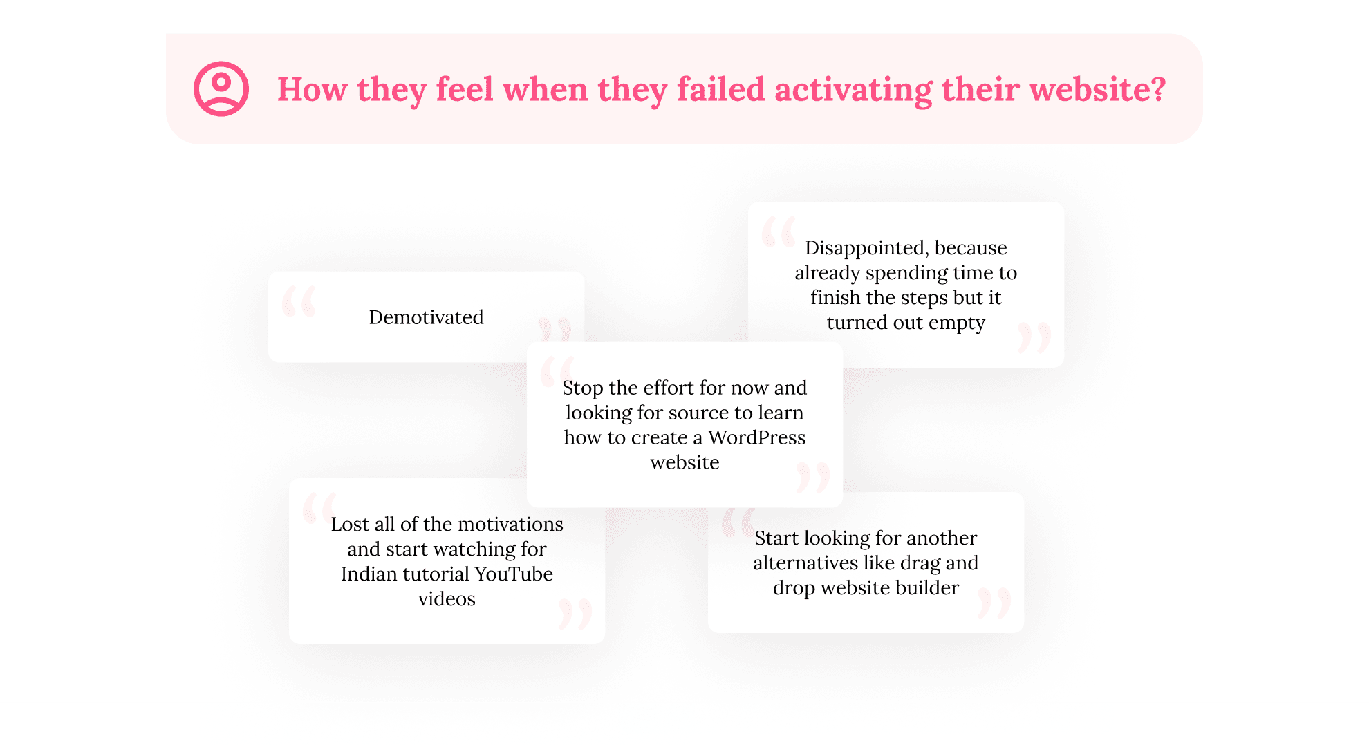
Most of the users stop their effort when they faced this kind of situation and look for the learning sources. And they even start to look for another easier alternative like a drag-and-drop website builder.
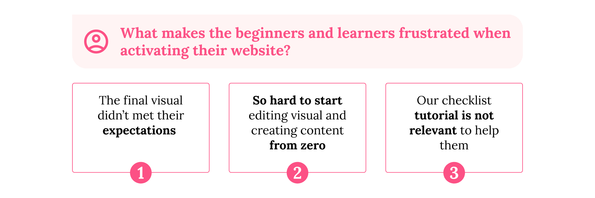
About the frustration source, they can get frustrated because of:
The final visual didn't meet their expectations
The final look of their website doesn't match what they expected from the theme selection screen. Beginners and learners spend a lot of time choosing their website's appearance, only to be disappointed by the end result.
Hard to start editing visual and creating content from zero
Starting to edit the visual and create content from scratch is challenging for everyone, from beginners to experts. Editing the website is harder than they anticipated, requiring more technical knowledge, especially since most themes provide only a basic starting point.
There are no relevant tutorials that can help them
Users struggle to find relevant tutorials to help them. While we offer a checklist of post-setup tasks, users feel it's not applicable in their editing process. They need detailed, step-by-step examples they can easily follow when customizing their website.
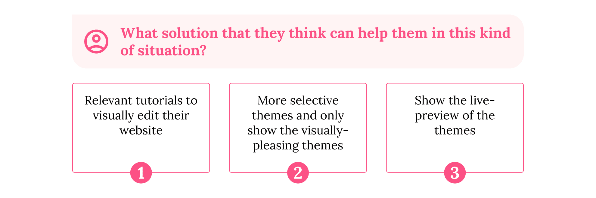
And about what they want to have to solve those problems are:
Relevant tutorials
Beginners and learners need tutorials that are easy to follow and specifically tailored to creating and customizing websites. While we have some step-by-step guides and tutorial videos, users feel they're not relevant enough.
Curated list of high-quality themes
Users are concerned about the quality of themes available, as many offer only basic templates with limited customization options. They want a selection of themes that are well-designed and easy to use, allowing them to start their website with minimal effort and expertise.
Live preview feature for themes
Users feel it's important to see a live preview of themes before selecting one. This functionality, common among our competitors, helps users make informed decisions and avoid disappointment based solely on thumbnails.
Based on these insights, we can get the keywords: start, edit, expectation, from zero, create. From those keywords, we can conclude that our problem statement for this case is:


Before jumping to the solution part, let's take a look in what we currently have in production. Here is the current theme selection page and how it currently works:
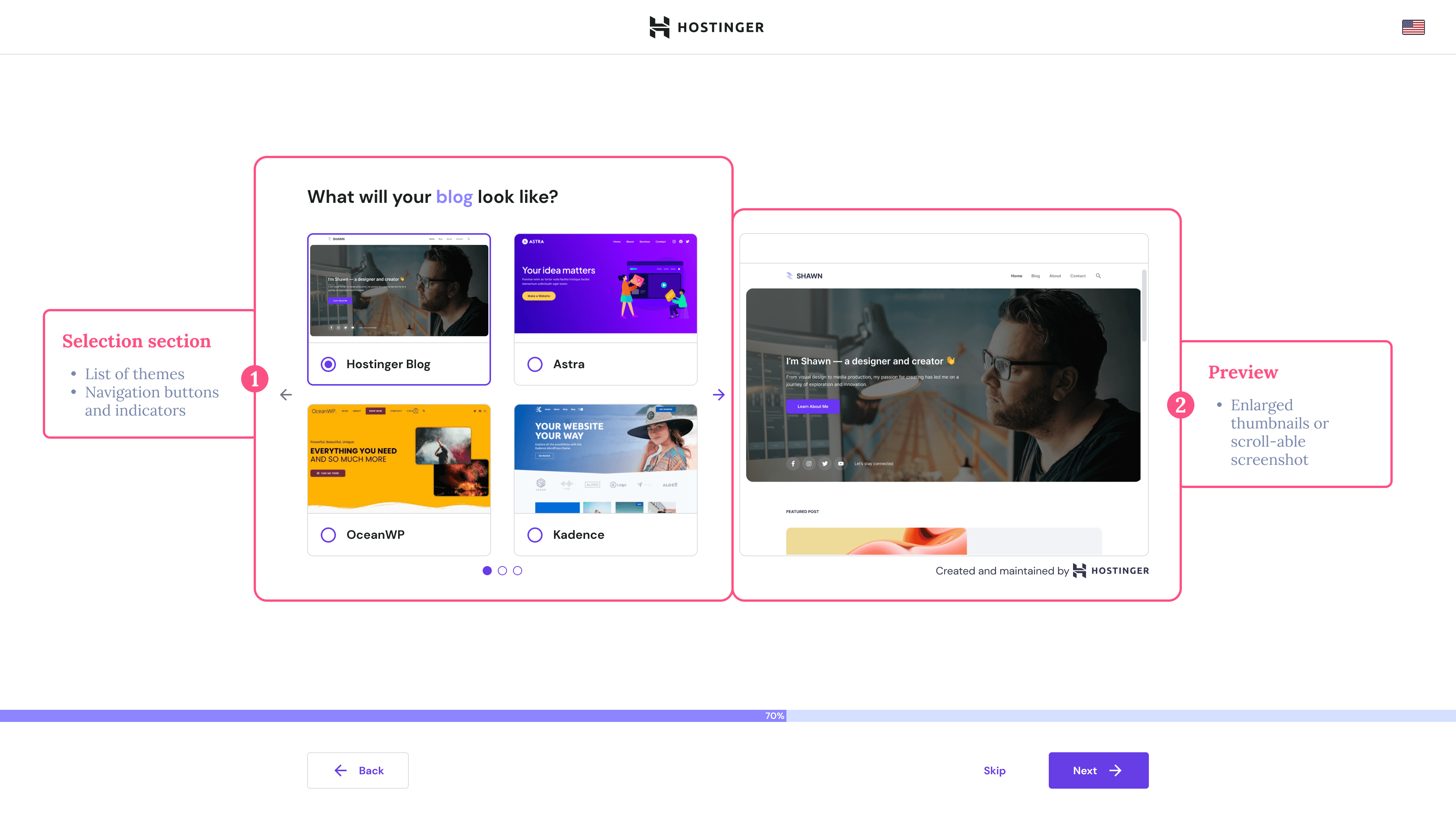
This screen is straightforward:
Users select a theme from a list for their visual layout. The list here already filtered and personalized based on what website type that the user chosen in the previous step, that's why the number of the theme is not that much compared to inside the WordPress Admin panel.
After choosing the theme, the user can preview available in the Preview section. However, we've observed that not all themes have representative screenshots. Consequently, for some themes, we only display enlarged versions of the thumbnails, which can raise user expectations about how their website will looks like.


To address this issue, we aimed to explore what solutions we already have available for users. We began brainstorming ideas with the following question:

From our brainstorming session, we narrowed down to one potential solution:

Even we have narrowed down the topic into that simple answer, however, we're faced with additional challenges and questions:
How the beginners and learners see the value Starter Template?
This involves grasping the mindset of beginners and learners. From previous discussions, it's clear that they prioritize the appearance and ease of editing over tools, features, or plugins. We need to convey the differences in a more relatable manner.
How can we differentiate between Starter Template and standard themes?
Since the distinction only lies in the output, it's challenging to showcase these differences before the editing stage. This option will be presented to users during the website preparation phase as an alternative to themes.
How can we serve this new feature to the user seamless but still deliver values?
Linked to the previous challenge, as both visual options serve similar functions, we must carefully outline the unique values of Starter Templates. This ensures a smooth transition for users while still highlighting the benefits of choosing this option.
To give more context on what Starter Templates is, here are the differences between templates and themes:
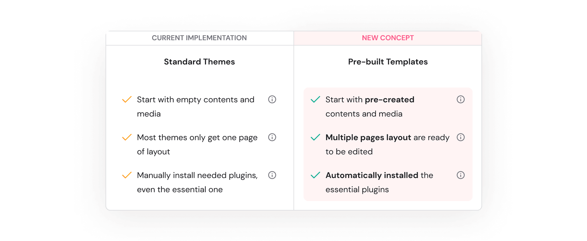


To address these questions, I conducted concept testing by presenting users with multiple alternatives and observing their behavior. Afterward, I asked for their opinions and validated the observation results. I opted for wireframe testing for its quick feedback and faster identification of potential issues. Here's the flow alternatives that I tested:
Alternative 1: Adding a new page to choose between templates and themes

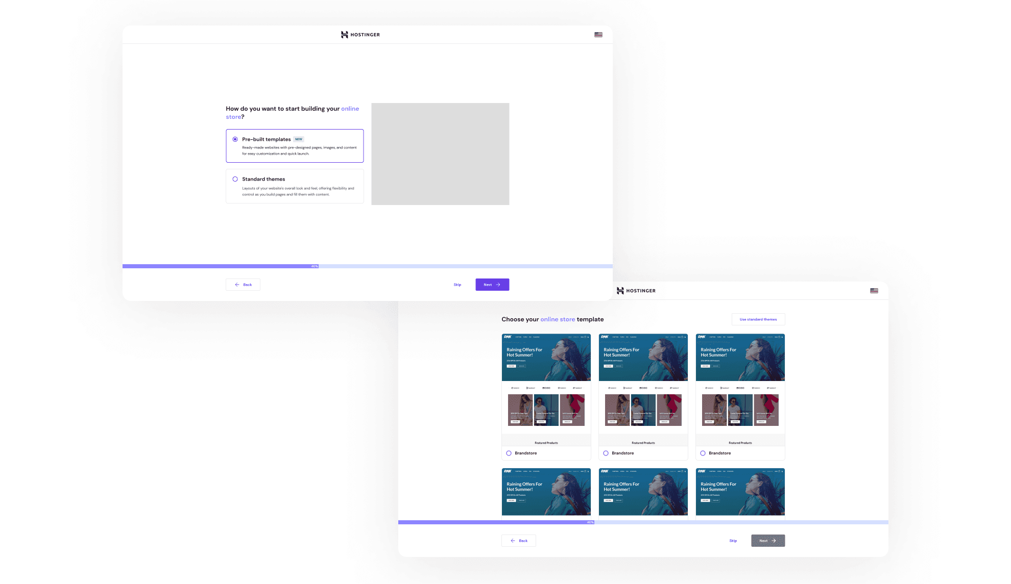
In the first alternative, I included a separate page to distinguish between templates and themes. This clear distinction helps users understand the differences between them right on the screen.
Additionally, I made some adjustments to the list view to cater to developers, as they are often familiar with this grid layout when selecting themes.
Alternative 2: Integrate the template list inside the theme list

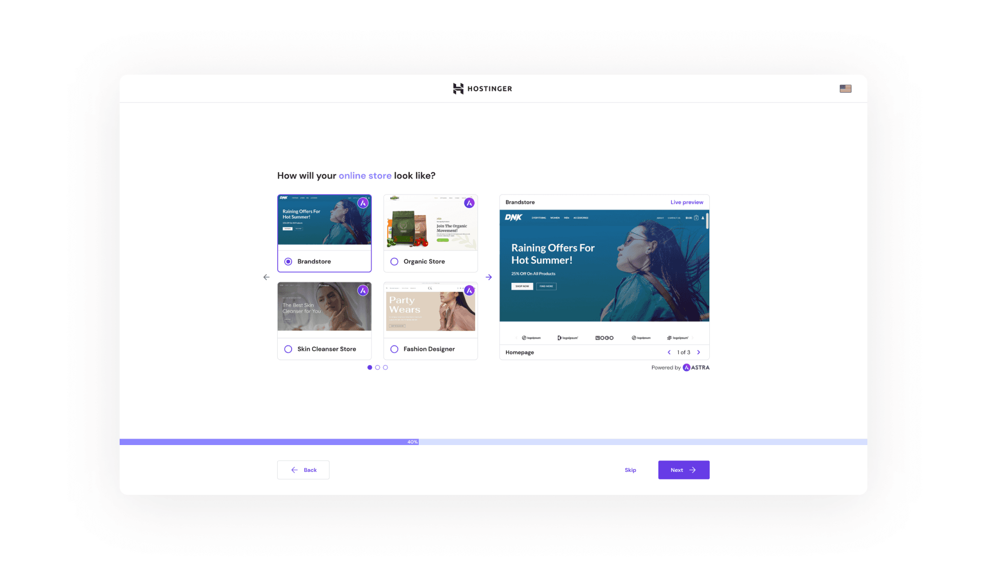
In the second alternative, I prioritized style and layout consistency to ensure a seamless user experience. To achieve this, I made templates and themes visually similar since beginners and learners mainly focus on the appearance of their website rather than technical terms.
In this alternative, templates are showcased on the first two pages followed by themes on subsequent pages. The team carefully selects the best templates and themes based on website type.
For the templates, I included an indicator to denote those provided by Astra. Additionally, I added pagination for easier navigation through page screenshots, giving users the impression that they'll have multiple pages ready for editing with just content and media adjustments.
Design hypothesis
Based on the data and insights I collected earlier, I was initially inclined toward the second alternative. From a design standpoint, it seemed compact, addressed all pain points, and fulfilled all purposes. However, it became apparent that this hypothesis didn't fully align with the user's perspective.
Testing results summary
Most testers preferred the first alternative. They wanted a clear distinction between templates and themes and visual representation of the output they would receive.
Regarding the second alternative, testers, including experts, found it difficult to distinguish between templates and themes. They perceived them as essentially the same, but with better visuals.
Despite the first alternative lacking illustrations, testers still felt unclear about the differences between templates and themes solely based on the written content. This suggests a need for illustrations to visualize the output and differences between the two.
The experts tend to have some considerations when choosing templates:
Number of pages that already pre-built
Pre-installed and supported plugins
Supported WordPress website builder(s)
Key features of the templates
Next action plans that will be the initial version
Start with the first alternative and then evaluate its effectiveness.
Design illustrations for templates and themes highlighting:
Differences - See previous table
Expected final output of the website
Also, include information about the number of pre-built pages for each template, as expert testers often consider this when making their selection.
Make the key features more standout


Templates/Themes selection screen
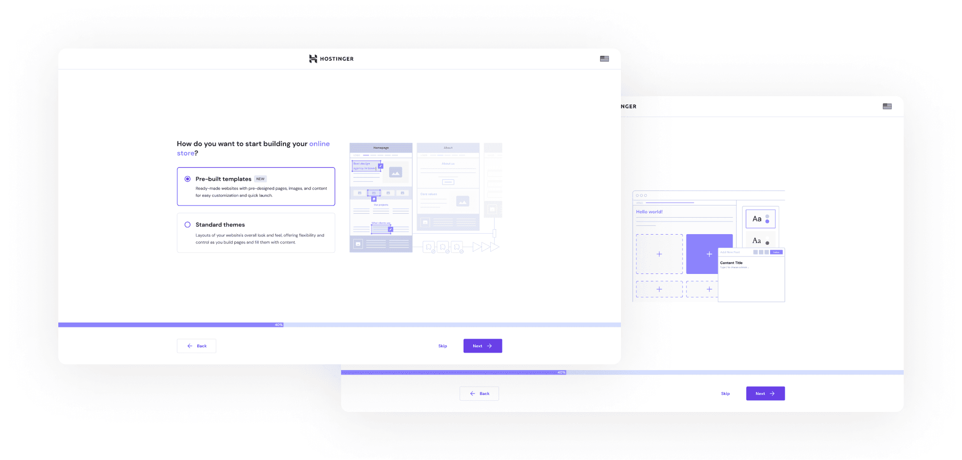
Before reaching this conclusion, I re-tested the illustrations by asking 10 colleagues from non-product departments about their interpretations and distinctions. Here are the keywords they provided:
Templates: multiple pages, instant editing, pre-defined contents
Themes: create new contents, start from scratch, style editing
Considering this perspective, I conclude that the illustrations meet the user's expectations, and we can proceed with them.
Templates list
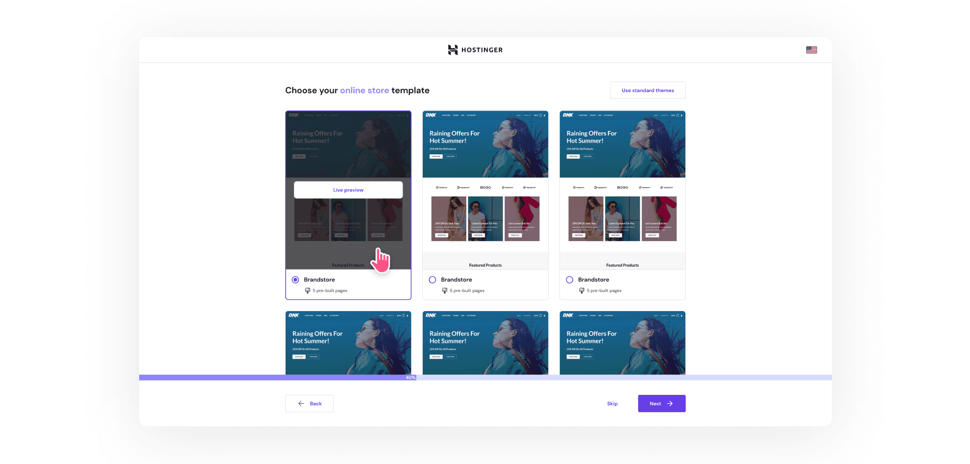
In this screen, my goal is to encourage users to preview their website live. With this layout featuring a prominent click-point for the live preview, I aim to prompt users to try out the templates before making a selection.
Template live preview and details
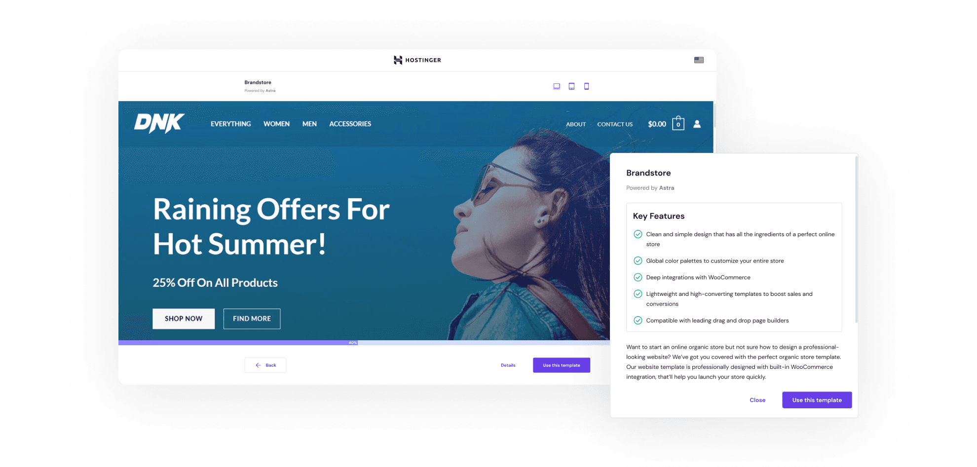
Initially, I prioritized the live preview feature, as it was what beginners and learners were eager for. In future iterations, I may include key features information within the template list to cater to the needs of experts more effectively.


To be transparent, as of the publication of this article, this improvement has not been rolled out globally. However, the team has launched this initiative in five regions, and the outcomes have been groundbreaking.
Winning the internal hackathon
This initiative was showcased in our internal UX Hackathon and secured second place.
Significantly increasing the activation rate (in those five regions)
Thanks to this initiative, the activation rate in the testing regions nearly tripled compared to the previous version. What's more impressive is that this increase occurred within the first week after the beta-release. This significant metric indicates that the initiative has notably accelerated users' workflow.
Unfortunately, due to company policy, I'm unable to provide more detailed information about this data. However, rest assured, it has proven to be highly effective from a business perspective.
Excellent satisfaction score (in those five regions)
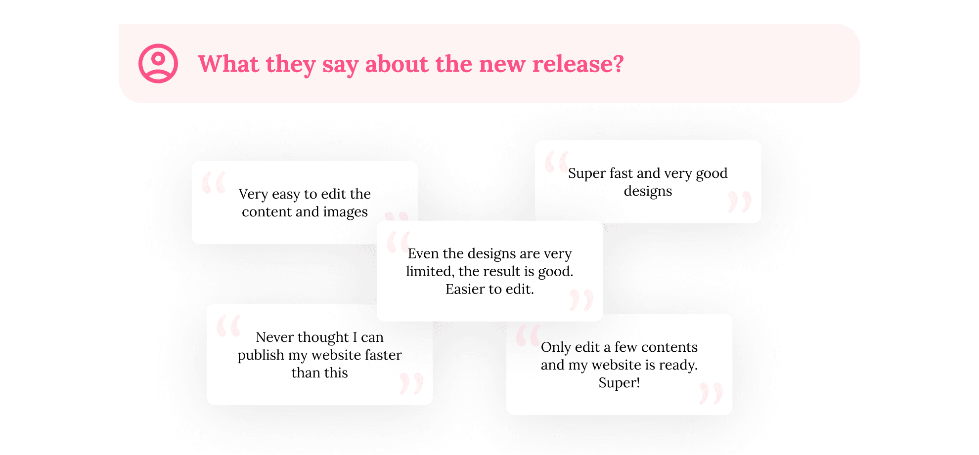
The team collected Customer Satisfaction (CSAT) scores and shared them with users a day after they published their websites. They rated us 4.78 out of 5, indicating excellent satisfaction. Here are some words from users regarding this release:


After released this initiative on several regions, we learned that the satisfaction of the users' website is in line with the easiness of first-creating the website. That's why our next iteration will focusing on that part, like:
Create our own pre-built templates
Based on the success of the initial version using Starter Templates from Astra, we're considering investing more effort into creating our own templates. These will offer easier customizations and a wider range of starting styles. We've already implemented similar functions in our own WordPress theme before and can replicate this for the templates.
Integration with our AI Content Creator
Currently, users still need to manually edit their content. However, we're confident that we can streamline this process by integrating our AI Content Creator tool. With this integration, users can get their website ready faster, potentially eliminating the need for manual editing altogether.


